By the Suzanne and Chad Team
The paint color on your walls does far more than fill space. It sets the emotional register of an entire room, shapes how expansive or intimate a space feels, and either harmonizes with or works against the natural light pouring through your windows. Before you open a color swatch book, it helps to understand that choosing paint is less an act of decoration and more an act of design science. There is a reason why interior designers treat color selection as one of their most consequential decisions, and it has everything to do with how the human brain processes light, contrast, and psychological cues.
Whether you are preparing a home for sale in Winter Park, FL, doing a full interior refresh, or simply trying to figure out why your living room never quite feels right, understanding the principles behind paint color selection will change how you approach every wall in your home. The best interior paint colors are not arbitrary; they respond to your architecture, your lifestyle, and the specific quality of light in each room.
This guide walks you through the science and strategy behind choosing paint tones that work, room by room, so every space in your home can reach its full potential.
Key Takeaways
- The direction a room faces and the quality of its natural light should be your first consideration before selecting any paint color.
- Undertones matter more than the dominant color on the swatch, because undertones determine how a color behaves on your specific walls.
- Neutral paint colors are not one-size-fits-all; warm neutrals and cool neutrals behave very differently depending on your lighting and furnishings.
- Each room in your home serves a different psychological purpose, which means the best paint color for a bedroom may be entirely wrong for a kitchen.
- Testing paint in your actual space, at different times of day, is critical before committing to a full application.
Light Is the Real Variable in Interior Paint Color Ideas
Most homeowners pick a paint color they love on the swatch and then wonder why it looks completely different on the wall. The answer is almost always light. The way natural and artificial light hits a surface changes how the pigment reflects back to the eye, and no two rooms in a home receive light in exactly the same way.
Rooms with north-facing windows receive cooler, more diffuse light throughout the day. This type of light can make cool-toned colors feel even colder and can strip warmth from colors that looked rich and inviting in the store. If your living room or bedroom faces north, leaning toward warmer hues with yellow, amber, or red undertones helps counteract that cool cast. South-facing rooms, on the other hand, receive warm, consistent light for most of the day, which means they can handle both cool and warm palettes with ease.
East-facing rooms are bathed in warm morning light but shift to a cooler, bluer tone by afternoon, so the best interior paint colors for these spaces tend to be soft and adaptable; warm whites, pale greens, and muted terracottas all perform well. West-facing rooms do the opposite, sitting in flat light during the morning and coming alive with golden warmth in the late afternoon and evening. In Florida's climate, where natural light tends to be abundant and bright, west-facing rooms in Winter Park homes can handle deeper, more saturated colors without feeling oppressive.
Light Factors to Assess Before Choosing Paint
- Window orientation (north, south, east, west) affects the temperature of natural light throughout the day.
- Ceiling height influences how a paint color reads; dark colors on high ceilings feel dramatic, while the same color on a low ceiling can feel heavy.
- Artificial lighting color temperature (warm vs. cool bulbs) interacts with paint pigment and can shift a color's appearance after dark.
- Sheen level affects light reflection; higher sheens amplify brightness and show imperfections, while matte finishes absorb light and hide surface flaws.
- The size of your windows relative to the room determines how much natural light is competing with the color on the walls.
Understanding Undertones
One of the most consistent sources of confusion in paint selection is the undertone, which is the secondary hue embedded within the primary color. A white that looks clean and bright in the paint store might reveal a green or lavender undertone once it goes on the wall. A greige that photographs beautifully in design magazines might read almost purple in your specific lighting conditions. Learning to identify undertones is the single most important skill in learning how to choose paint colors with confidence.
Every paint color has an undertone, including neutrals. Whites can carry undertones of pink, yellow, blue, or green. Grays often lean either blue-purple or warm taupe. Even beige varies wildly, with some versions reading nearly orange and others appearing almost lilac, depending on the light. When selecting paint, hold your swatch against the largest fixed element in the room, whether that is your flooring, cabinets, or countertops, and look for undertone conflict. If your hardwood floors have orange-red undertones and your paint carries a green undertone, the two will fight each other visually.
The solution is to work with undertones rather than against them. Identify the dominant undertone in your existing finishes and furnishings, then choose a paint color whose undertone either matches or complements it. In rooms with warm-toned wood furniture, cream and warm white paint colors will feel cohesive. In rooms with cool gray tile or stainless appliances, paint with blue or green undertones will feel intentional rather than accidental.
How to Identify Undertones on a Swatch
- Hold the swatch next to a pure white piece of paper; the difference in hue will reveal the undertone clearly.
- Compare swatches side by side in the same light source you will use in your room, not the overhead fluorescents in the paint aisle.
- Look at the swatch in both natural daylight and artificial evening light before deciding.
- Ask for a peel-and-stick sample rather than a tiny paper swatch, which is too small to read accurately on a wall.
- Test the color on at least two adjacent walls to see how the undertone reads at different angles.
Room-by-Room Guide to the Best Interior Paint Colors
The psychology of paint color shifts depending on the function of the room. A bedroom serves a different neurological purpose than a kitchen or a home office, and the science of color supports choosing paint accordingly rather than defaulting to a single palette throughout the home.
In bedrooms, the goal is rest and calm. Soft blues, muted greens, and warm lavenders are the most conducive colors for sleep quality. In Florida homes where natural light is abundant, soft sage greens and dusty blues feel both restful and connected to the surrounding landscape.
Kitchens and dining rooms respond well to color strategies that stimulate appetite and energy without veering into overwhelming territory. Warm whites, creamy yellows, soft terracottas, and muted brick reds have long been favored in these spaces. Kitchens, in particular, benefit from paint that coordinates cleanly with cabinetry; if your cabinets are white or off-white, a warm greige or pale sage on the walls creates depth without competition.
Living rooms, as the most public and socially active space in a home, benefit from interior paint color ideas that feel both welcoming and sophisticated. Warm neutrals, earthy tones, and soft organic palettes work well here, particularly in open-concept layouts where the living room shares visual space with adjacent dining or kitchen areas.
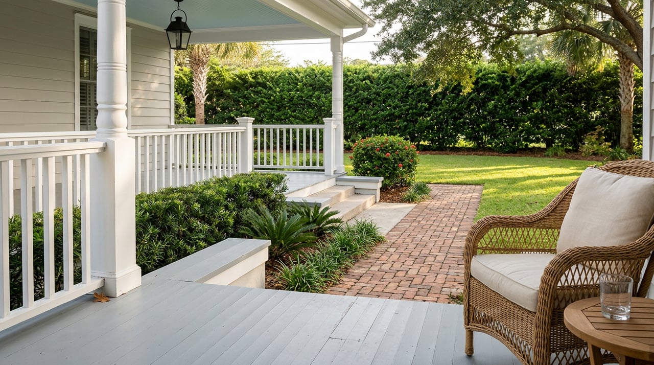
In Winter Park, FL, where Spanish-influenced architecture, Craftsman bungalows, and contemporary new builds all exist on the same street, paint choices that honor architectural character tend to age the best.
In bedrooms, the goal is rest and calm. Soft blues, muted greens, and warm lavenders are the most conducive colors for sleep quality. In Florida homes where natural light is abundant, soft sage greens and dusty blues feel both restful and connected to the surrounding landscape.
Kitchens and dining rooms respond well to color strategies that stimulate appetite and energy without veering into overwhelming territory. Warm whites, creamy yellows, soft terracottas, and muted brick reds have long been favored in these spaces. Kitchens, in particular, benefit from paint that coordinates cleanly with cabinetry; if your cabinets are white or off-white, a warm greige or pale sage on the walls creates depth without competition.
Living rooms, as the most public and socially active space in a home, benefit from interior paint color ideas that feel both welcoming and sophisticated. Warm neutrals, earthy tones, and soft organic palettes work well here, particularly in open-concept layouts where the living room shares visual space with adjacent dining or kitchen areas.
In Winter Park, FL, where Spanish-influenced architecture, Craftsman bungalows, and contemporary new builds all exist on the same street, paint choices that honor architectural character tend to age the best.
Color Directions by Room Type
- Bedroom: soft blues, muted greens, warm lavenders, and dusty rose for calm and rest.
- Kitchen and dining room: warm whites, creamy yellows, terracotta, and muted brick reds for energy and warmth.
- Living room: warm neutrals, earthy tones, and rich greiges for a sophisticated, welcoming atmosphere.
- Home office: muted greens and slate blues for focus; warm whites for creativity and openness.
- Bathroom: pale aquas, warm whites, soft grays, and blush tones to create a spa-like feel.
The Role of Neutral Paint Colors
Neutral paint colors dominate real estate staging for good reason. They recede visually, allowing architecture and furnishings to take center stage, and they appeal to the widest range of buyers and residents. But not all neutrals are created with equal versatility. Understanding the spectrum of neutral paint colors —and how they interact with each other across adjoining rooms — is essential for creating a cohesive whole-home palette.
A common mistake is selecting a different neutral for every room without considering how they read in relation to each other. When you walk from a warm, beige living room into a cool gray hallway and then into a white bedroom, the shifts can feel jarring rather than intentional. The most polished interior palettes use a consistent undertone throughout; all warm neutrals or all cool neutrals, with intentional contrast introduced only through accent colors, textiles, and furnishings.
In open-floor plan homes, which are prevalent in Winter Park's newer construction and renovated mid-century properties, a single base neutral applied throughout the main living areas creates visual continuity and makes the space feel larger and more cohesive. Variation can then be introduced in rooms with closed doors, where a deeper or more saturated color becomes a contained, intentional choice rather than a disruption to the overall flow.
Popular Neutral Families and Their Undertones
- Warm white: undertones of cream, yellow, or blush; works best in south- and east-facing rooms with warm wood or brass accents.
- Cool white: undertones of gray, blue, or green; ideal in modern or coastal interiors with chrome, white oak, or marble finishes.
- Greige: a blend of gray and beige that reads differently in every light; versatile but requires careful undertone testing.
- Warm gray: undertones of taupe or lavender; popular in transitional interiors and tends to read as sophisticated without feeling cold.
- Soft white with off-white trim: a classic approach that adds depth and architectural definition without committing to color.
FAQs
How Do I Know Which Paint Color Will Look Right in My Room?
Start with your light source and your fixed finishes before you even look at swatches. Determine which direction your windows face, identify the undertones in your flooring and major furniture pieces, and select paint that works with those conditions. Once you have narrowed down your choices, test large samples directly on the wall and observe them at multiple times of day before making a final decision.
Should Every Room in My Home Be the Same Color?
Not necessarily, but they should share a relationship. Using the same undertone family across your open-plan areas and main living spaces creates visual flow, while closed rooms offer an opportunity to introduce more character through deeper or more saturated tones. A home with a thoughtful whole-home palette reads as more intentional and curated than one where each room was selected in isolation.
How Does Florida's Natural Light Affect Interior Paint Colors?
Florida's bright sunlight intensifies colors, which means colors that read as soft and muted in a showroom can feel loud on the walls of a sun-drenched home. As a rule, go one to two shades lighter than your instinct suggests, particularly for south-facing rooms. Muted, earthy tones and warm whites tend to hold up best in high-light environments without appearing washed out or overwhelming.
What Finish Should I Use for Each Room?
Eggshell and satin finishes are the most versatile and work well in living rooms, bedrooms, and hallways. Semi-gloss is preferred for kitchens, bathrooms, and trim because it is more moisture-resistant and easier to clean. Flat or matte finishes work beautifully on ceilings and in low-traffic areas where a soft, light-absorbing look is the goal. Avoid high gloss on walls unless you are going for a very specific, intentional effect in a small accent space.
The Right Palette Starts With the Right Perspective
Color is not just a cosmetic decision; it is an architectural one. The tones you choose determine how a room feels in morning light and how it reads during a dinner party in the evening. They affect perceived square footage, the apparent height of your ceilings, and the way your furnishings feel within the space. When approached with intention and a clear understanding of your light, your architecture, and your goals, interior paint color selection becomes one of the highest-impact upgrades available to any homeowner.
Whether you are preparing your Winter Park home for the market or investing in a full interior refresh for your own enjoyment, a thoughtful paint palette is one of the best places to start. The Suzanne and Chad Team would love to help you understand how strategic updates, including color choices, can position your home for maximum appeal in the Winter Park real estate market. Connect with our team today to start the conversation.
Whether you are preparing your Winter Park home for the market or investing in a full interior refresh for your own enjoyment, a thoughtful paint palette is one of the best places to start. The Suzanne and Chad Team would love to help you understand how strategic updates, including color choices, can position your home for maximum appeal in the Winter Park real estate market. Connect with our team today to start the conversation.